Pure Gold Productions
Now, for a logo we wanted something simple and classy. Premium colours immediately came to mind.
The colour of Purity is traditionally white.
Gold, well we just had to use Gold as a colour for a name containing Gold!
And a third colour was added as we played about with the the first two colours – Purple. Purple is also physcologically seen as a ‘luxury’ colour. If you think about it, the colours most obvious use in branding is by Cadbury’s who use it on their chocolate bars. What better way to say luxury than with a colour used on a chocolate bar right?
Predominantly, the logo was designed to show up well with no background, so it just sits on the website over the page background.
But where needed, for example on letterheads and business cards, we decided to sit the logo against a brownish maroon colour, as shown in the logo above.
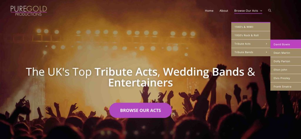
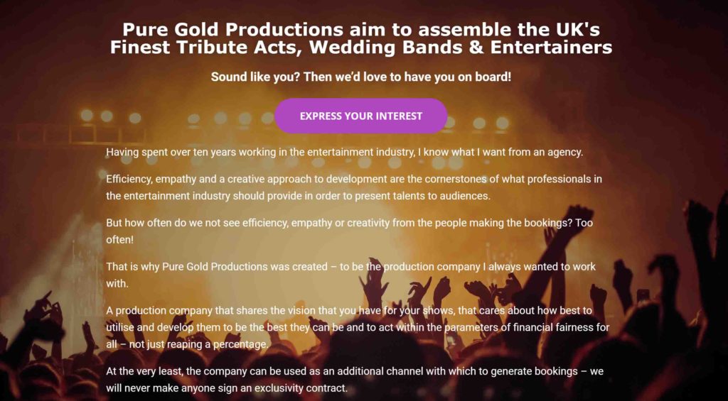
Pure Gold Productions are a production company that acts as an agent to tribute acts, wedding bands and entertainers across the UK.
To be there at the very start is always a privilege as we love to be involved in shaping a company and watching it grow!
When the business came to us, it was just an idea with not even a company name!
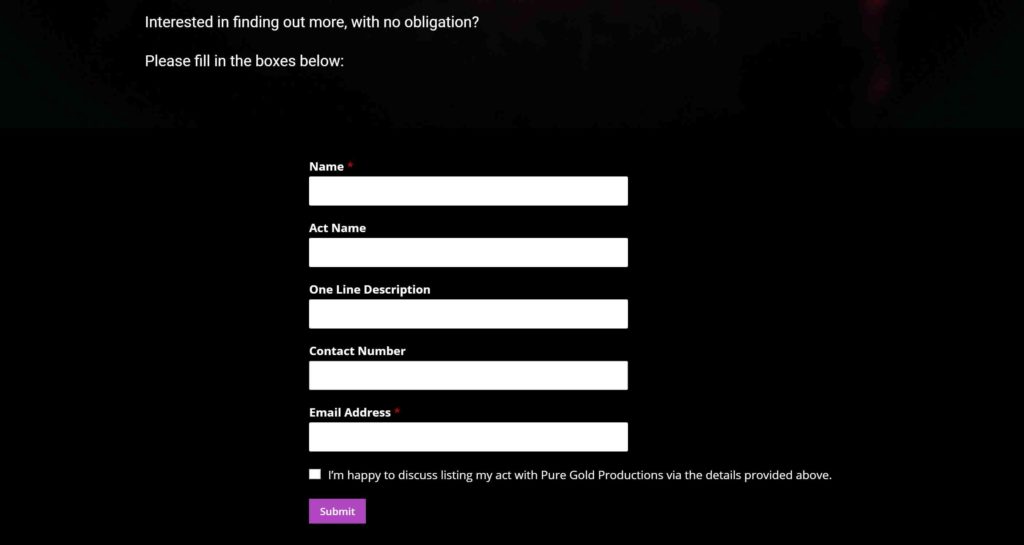
Alongside trying to think of a name, we began by devising a simple lead form to enable the business to begin approaching potential acts and giving them somewhere to sign up to become involved with the project.
The form was a simple contact form linked direct to the clients email address, complying to GDPR procedures.
The name was a tough task. We worked closely with the business owner on this, with daily texts and email conversations trying to come up with good, high end premium sounding names.
We worked through many options, with the aim of finding something unique where we wouldn’t have to compromise on getting the domain name for the website.
Eventually, after much to-ing and fro-ing, the name Pure Gold Productions was chosen!
Next up we began to design the website that would be seen by potential venues to allow them to browse acts .
We carried through the colour scheme we had devised for the logo design into the website design to create brand consistency.
We designed smooth, easy to navigate dynamic menu’s allowing the website user to simply navigate through to find their ideal tribute band or performer.
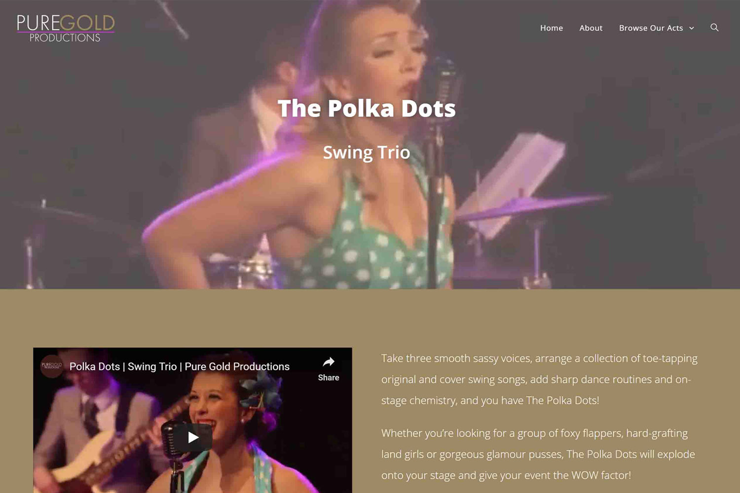
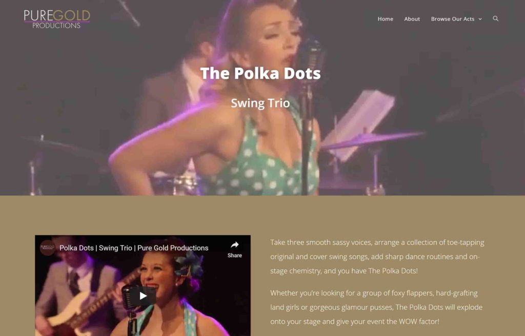
On the acts page, we came up with something quite revolutionary in comparison to competitors. We pushed an video content to the top! This created a moving image in the header to draw the website users interest and the ability to play and listen to the band immediately whilst reading a description about the act.
By creating the company a You Tube channel and hosting content there, it meant the website load times didn’t get bogged down – as you often find with hosting video directly on a website.
The other advantage with setting the company up on You Tube – it is second only to Google as a major search engine meaning more exposure for the brand.
